When people ask you how you spent your summer holidays, making an interactive map showing the party vote swing from 2020-2023 isn’t the most riveting answer, but I have to say I’m pretty proud of my latest tool.
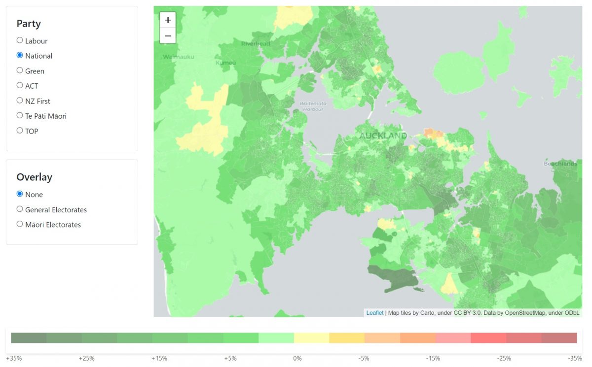
In politics, understanding changes in voter behaviour is crucial. My 2020-2023 Election Swing Mapping Tool is designed to shed light on this very aspect. It provides a detailed visualisation of the swing in voter preferences between the 2020 and 2023 elections across small geographic areas known as SA1s.
SA1, short for Statistical Area 1, is a geographical region used in census data. Each SA1 encompasses a population of approximately 100 to 200 residents, with a maximum of around 500 people. This small-scale focus offers a granular view of voting patterns.
I’ve calculated the swing for each party at each polling booth in NZ, and then written an algorithm that assigns an average swing for each SA1 based on a weighted average of the swing results of the five nearest polling booths to that SA1, based on distance from the centre of the SA1 to the booth.
This is a statistical representation and there are two main drawbacks. The first is that it is essentially working on the assumption that people vote at their closest booth, which is obviously not always the case. The second is that special votes are not allocated to a booth, so this data does not include any special votes (it does however include advance votes, which are linked to a booth).
One interesting fact is that the same sort of methodology can yield a far more accurate result in Australia, where the electoral commission will provide political parties with a list of who voted, and at which booth they voted, so you can take this down to an individual level.
I’ve already spotted some interesting trends in the data – I’m very keen to hear if you see any, and if you find the tool useful. Likewise, if you’ve got any questions or ideas please get in touch.
Lastly – huge thanks have to go to my friend Jake Clarke, who massively helped me pull together the Geoserver backend which is serving up the map layers. His expertise with this technology is second to none, and if you’ve got a political mapping project I highly recommend you reach out to him.